Sir,
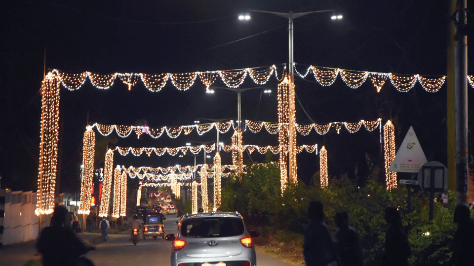
It is commendable that the Chamundeshwari Electricity Supply Corporation (CESC) has made sincere efforts in illuminating our city for Dasara. But the results are debatable. While the lighting is a lot more extensive than the previous years, the quality and technical artistry are conspicuously missing.
It is so monotonous that if you see one road, it looks like you have seen them all. The same hanging lights from the buildings and the same contouring chain lights around all the tree trunks.
To their credit, the chosen colour scheme (warm white) is very sober and elegant. People around me who have seen the world keep talking about the wonderful motifs and technically skilful varieties of lighting of the buildings and streets in different cities during festivities.
Secondly, the glaring omission of some of the most relevant heritage buildings as well as indifferent and inadequate illumination of some are baffling. To name a few, ignoring iconic buildings like the Maharaja’s College or Attara Kacheri as well as poor illumination of Crawford Hall and Oriental Library are inexcusable and insulting.
The illuminated models of the Palace in Ramaswamy Circle and a few more in Doddakere Maidan and other spots stand out and look great. But laser images, 3D-effects and changing colour motifs which could have made the illumination a lot more spectacular are not there at all. However, the saving grace is retaining the traditional lighting of Mysore Palace, making it look as majestic and grand as ever.
Overall, it looks like a great project poorly executed due to an obvious lack of imagination, technical competence, artistic taste and coordination skill among the authorities. We can only hope that at least in the coming years the task will be entrusted to genuine professionals in the domain with independence and funds to highlight the grandeur of our beautiful city.
– Dr. M.G. Srinath, Saraswathipuram, 30.9.2022
You can also mail us your views, opinions, and stories to [email protected]


I was utterly disappointed and annoyed by the tone and tenor of this letter. Reminded me of hit pieces by NYTimes and WP written with the sole purpose to show us in bad light (no pun intended).
I would like to convey my regards and gratitude to the concerned authorities who have done a commendable job of lighting up Mysuru. The color scheme this year is indeed spot on.
I also hope that, people who like to express their views on public matters, do learn some decency and proceed with a positive spirit to set about changes and not use trolling as a means to vent on public forums.
PS: The language used to express your ‘cons’ are so scathing that the numerous ‘pros’ you mention (I agree with all of them) are totally eclipsed and leave a bad taste overall.